Theme editor
This document explains how to use the theme editor to customize the look and feel of your end users' MFA graphical interfaces.
You can customize the following interfaces look and feel:
TrustBuilder Authenticator 6 app → general interface and authentication page
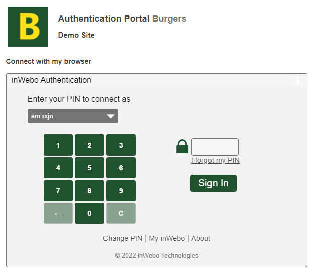
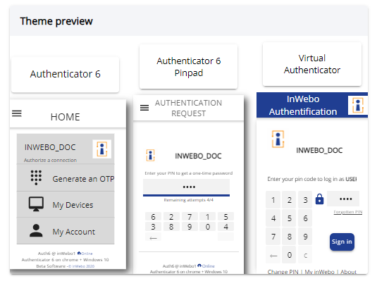
Virtual Authenticator authentication page (see examples screenshots below)
The following connector authentication pages: OpenID connect and Entra ID (formerly Azure AD)

Prerequisites
Before you begin, make sure you have:
an administrator login to access the administration console,
a TrustBuilder MFA service activated (the customized theme will be applied for the end-users registered in the service).
The theme editor is available for versions 6.16 and higher of the TrustBuilder Authenticator app.
Accessing the theme editor
You can access the theme editor from the administration console V2, in the “Graphical themes” tab.
Overview
From the theme editor home page, you can see:
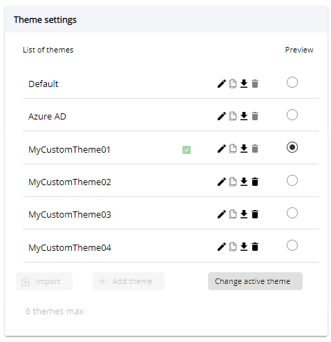
a Theme settings panel the list of themes from which you can manage themes and change the active theme.

a Theme preview panel (Click-scroll horizontally to see more interfaces previews).

Using the theme editor
By default, the active theme is none. This means that no theme from the “Theme editor” is applied to the interfaces. The interfaces are in their initial appearance. It is the default value when using the “Theme management” feature.
Creating a new theme
To create a a new theme:
Click the “New theme” button at the bottom of the themes list.
Enter a name for the new theme and click on “Save”. The new theme now appeared in the themes list.
Click the edit button (pencil icon) of the new theme to access the theme settings.

Configure the new theme’s settings
Settings | Description |
|---|---|
Theme Name | Edit the theme name |
Header | Not yet usable |
Message of the day | Edit the message of the day. The message of the day lets you inform users about important information. This message is displayed in Virtual Authenticator only. You can click the “Translation” icon to define this setting in others languages. |
Text alignment | Not yet usable |
Text area background | Set the main text area background. |
Page background | Set the page background. |
Banner color | Set the banner color. It is the top area in Virtual Authenticator (VA). |
Buttons and text highlight | Set the main color. It is used for the main button and text highlights. |
Text color | Set the text color. |
Input field background | Set the input fields background. |
Error message: | Set the text color of error messages (only on Entra ID (formerly Azure AD) and OIDC). |
Pinpad button color | Set the background of pinpad button |
There can be a maximum of 4 custom themes.
Think about accessibility when setting colors. The combination of text color and text area background has an impact on readability. In general we recommend previewing the theme before deploying it.
Importing a theme
Importing a theme is useful if you want to apply a theme from one service to another service (See “Manage themes” section below to know how to export a theme)
Click on Import and select your JSON file to import a theme.
Applying a theme
Click on Change active theme in the Theme settings panel.
Select the theme you want to become the active theme for the interfaces and click on Save.
The active theme appears with a check icon.

Active theme
Here are some information concerning the selected active theme:
none → this means that no theme from the “Theme editor” is applied to the interfaces. The interfaces are in their initial appearance. It is the default value when using the “Theme management” feature.

Default → this is the “Theme management” feature default theme. It cannot be edited. It's almost the same as if no theme had been applied. The default theme uses colors from the TrustBuilder graphical identity. Depending on the tool (VA, Authenticator…), some of the colors can be slightly different.
Azure AD→ this is a theme with Microsoft Entra ID (formerly Azure AD) graphic charter applied on interfaces. It cannot be edited.
custom themes → any other custom theme can be edited. The selected theme will be applied to the interfaces.
Managing themes
Use the tools panel to manage your themes.

Edit the theme
Duplicate the theme
Download the theme (.json file)
Delete the theme
Pinpad visibility on TrustBuilder Authenticator (version 7)
With the ‘Default’ or ‘Azure AD’ theme applied to Authenticator 7, button of the pinpad may not be very visible. To resolve this issue, you can disable any Active theme
Log in to Admin Console v2.
Go to Settings > Graphical Themes > Change Active Theme
Select "None" and save.
The change will be applied to users as soon as they perform an operation that synchronizes the app with the back end (authentication, OTP generation, etc.).
